Girls & Boys Town
A multi-role fundraising CRM for a national children's charity, replacing spreadsheets and institutional memory with a single donor record that serves the consultant on the road, the manager approving their work, and the director reading the national picture.
UX Researcher and UI/UX Designer, working as the sole point of contact directly with the client throughout the engagement.
The problem
Girls & Boys Town South Africa funds residential care, family outreach and education programmes across nine provinces entirely through donors: individuals on monthly debit orders, corporates, family trusts, foundations. The fundraising operation behind that funding had no system holding it together. Consultant notes lived in personal spreadsheets. Donor transfers between consultants happened over email. Section 18A tax certificates were generated one at a time, by hand, at the busiest point in the financial year. When a consultant left, their relationship knowledge left with them. The organisation had a functional requirements document and a set of Figma screens, but not a product. The requirements described features; the screens described fields. Neither described what a consultant actually does at 9am on a Monday, and four different roles were all meant to work off the same data without getting in each other's way.
The goal
One record per donor that every role can trust: a consultant sees what needs them today, a manager sees what is blocked, and leadership sees the national picture, without anyone maintaining a spreadsheet on the side.

User research
There were no users to interview at the outset, since this was a system being specified before it was built, and my access was to the client's documentation and the client themselves. So the research was documentary and diagnostic rather than generative. I worked through the functional requirements document line by line and audited the existing Figma file against it, looking specifically for the gaps between what was specified and what would actually happen in use. Then I took the questions that surfaced directly to the client, in sessions I ran myself, and treated their answers as the primary evidence.
The requirements described fields and features, not tasks. Nothing in them answered "what does a consultant do first thing on a Monday?"
Four roles had been treated as permission levels on one interface, when they have genuinely different jobs.
Several requirements would have caused problems downstream: deletable records destroying audit trails, dashboards promising analytics the product did not have.
The most painful job in the fundraising year (tax season) was specified as a single-record action, with no acknowledgement of volume.
Roles
Service Consultant
Manages a portfolio of prospects and donors. Needs to know what needs them today, and to log what happened without it feeling like admin.
Branch Manager
Runs a branch team. Needs to see what is blocked, approve or reject their consultants' requests, and know who needs support.
Head of Fundraising
Owns the national picture. Needs targets, regional performance and the exceptions worth escalating, not the day-to-day.
Super Administrator
Keeps the system honest. Needs final approvals, user and branch management, and a system-wide view across every branch.
Journey map
I mapped the consultant's relationship cycle end to end, the role with the most daily contact with the system, to find where the record actually breaks down.
Prospect research
Notes in personal spreadsheets, no shared history.
Working blind
One profile carrying the full relationship history.
Contact and logging
Calls happen, notes get written later or not at all.
Behind
Make logging faster than not logging.
Follow-up
Reminders live in personal calendars, disconnected from the record.
Anxious
Link the task to the conversation that caused it.
Conversion to donor
Contribution captured, banking details re-entered each time.
Repetitive
Capture banking once; reuse it everywhere.
Stewardship and compliance
Tax certificates hand-generated, one at a time, in season.
Overwhelmed
Bulk generation, with the record updated automatically.
Handover and transfer
Reassignment over email; history often lost.
Rushed
A traceable approval chain that carries the record with it.

Testing before building
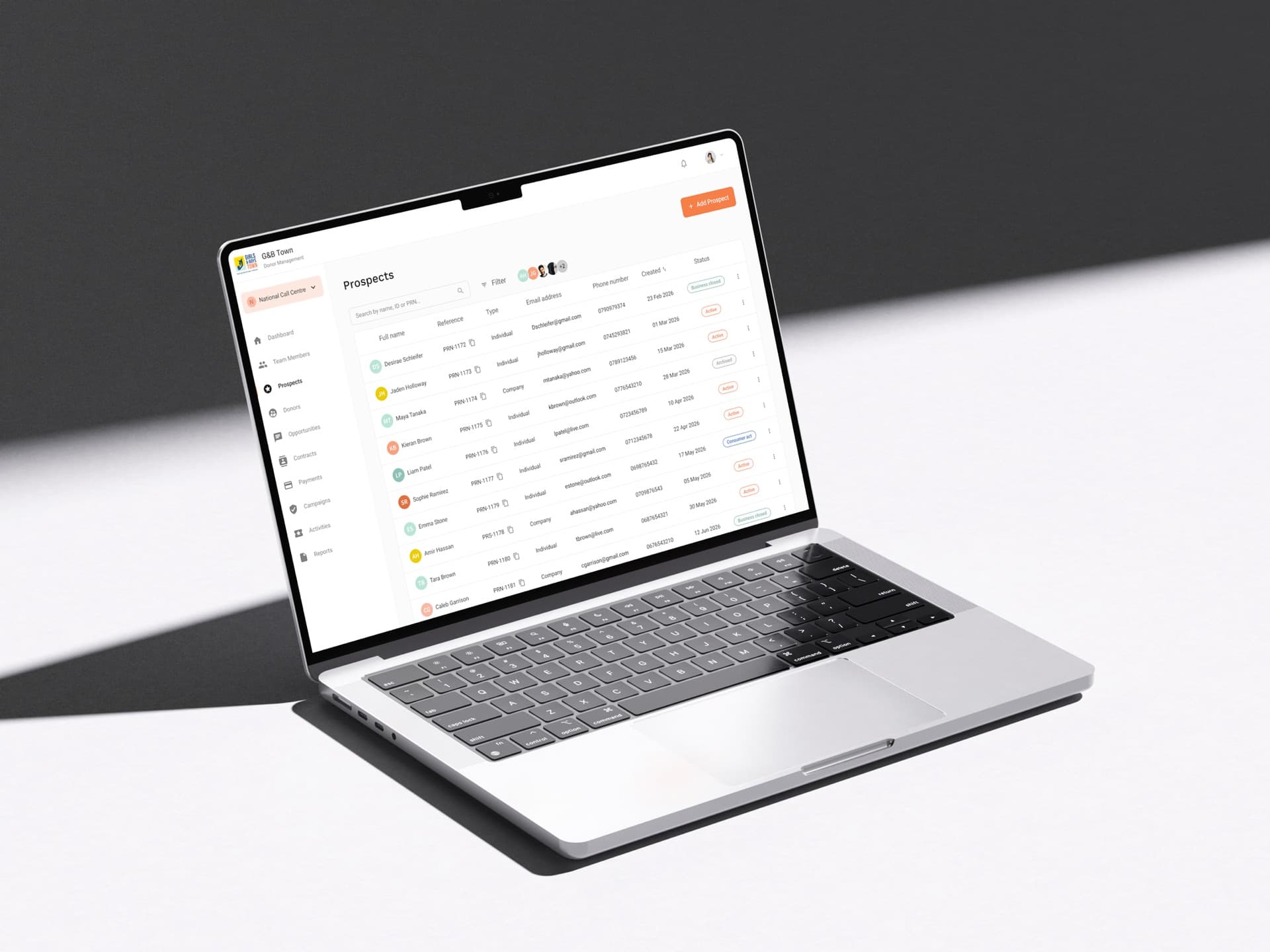
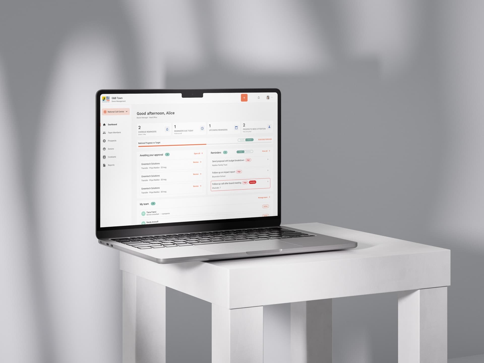
The whole system was built and tested as a working prototype before any of it was designed in Figma. I used Claude to stand up all 19 screens across the four roles as connected pages: real navigation, real state, every empty, loading, success and error state, and a role switcher that re-renders the entire application when you change persona. The client could click through their own product, as any of its four users, weeks before a single screen was drawn. That changed what the review sessions were. Instead of presenting a transfer-approval screen and talking through it, I could say “approve this request” and we would both watch what the consultant receives. Feedback stopped being layout opinion and became whether the flow was right. Scoping problems that would have been expensive to unpick after visual design and development surfaced while they were still a five-minute change: a feature that felt essential for one role turning out to be noise for another, an approval step missing a notification nobody had specified, a screen that no role actually needed. Several of the decisions below were settled in a single session because the client could feel the consequence instead of imagining it. Only what survived that testing went into Figma for visual design, and then into development.
The brief had completed reminders being deleted once actioned.
Clicking the diary end to end in the prototype made it obvious the history was the asset. Moved to an archive pattern, and the client signed it off in the session rather than a follow-up email.
One dashboard, with content shown or hidden by permission level.
Running each role against it live showed most of the dashboard was irrelevant to whoever was looking. Split into four purpose-built dashboards before any of them were designed.
Tax certificates handled one donor at a time, as specified.
A mock run at tax-season volume in the prototype made the single-record flow indefensible. Added the bulk flow and the outstanding-count prompt while it was still just a wiring change.
Prototyping this way keeps moving the point where a decision gets made earlier, and cheaper: Figma and development only ever touch things a real person has already reacted to. The part that carries the most value is framing the right thing to put in front of the client and reading the response honestly, not producing the first artefact. End-user testing with fundraisers is the next step, and the prototype is already the thing to run it on.
Component library
This was a system design, not a rebrand: the organisation's existing mark stayed as-is, and the work went into building one shared system rather than per-page styling. A single token set for colour, type and spacing, with shared navigation, cards, modals, tables, toasts, status pills and empty states reused across all 19 screens. Two patterns did the most work. Status pills carry meaning consistently wherever a record has state, so a colour learned in one place reads correctly everywhere. And every state is designed, including the ones usually skipped: first-run empty states, filtered-to-nothing states with a clear route out, in-flight loading, and errors that say what to do next. What follows is a snapshot of the system, not the full component set.
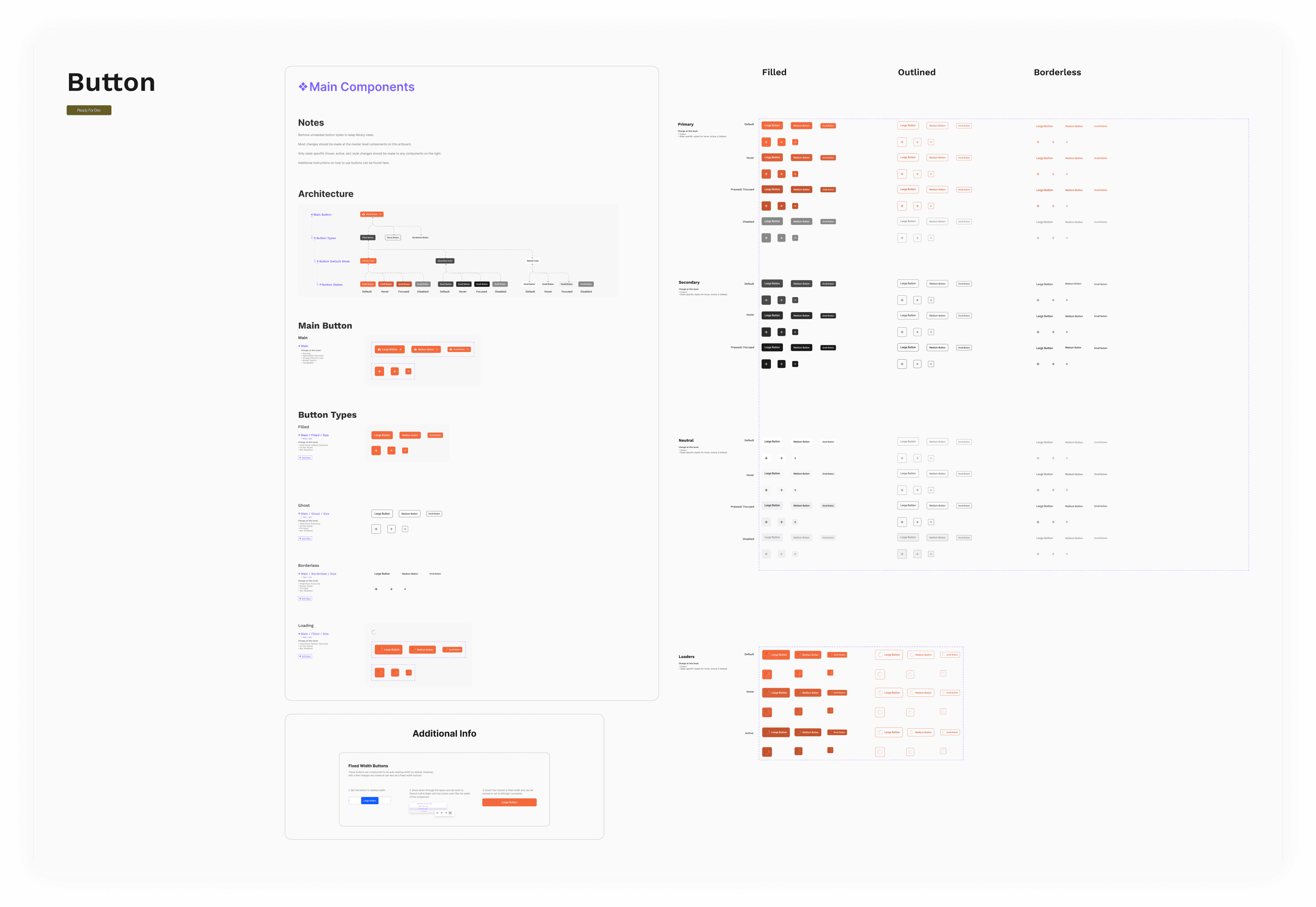
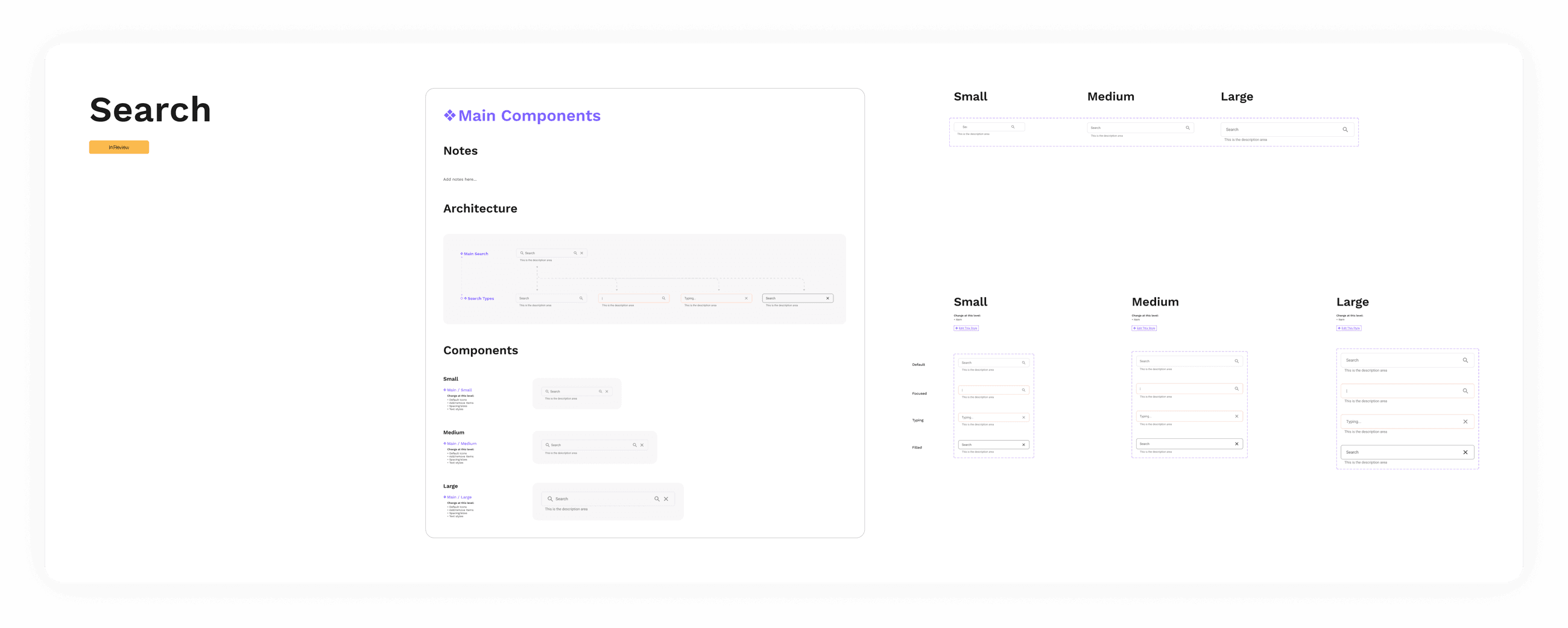
On a warm neutral base, each colour maps to one system meaning and is used nowhere else, so a status learned in one place reads the same everywhere.
Identity
The charity's existing orange, fenced off to identity and primary actions only, so it never competes with a status.
Information
Neutral system messages and in-progress states.
Confirmed
Approved, sent, reconciled — anything successfully done.
Caution
Needs attention soon: a deadline approaching or data missing.
Overdue
Past due or destructive: overdue follow-ups, delete actions.
Plain, specific, and never blaming. Buttons name their consequence; errors say what to do next.
Work Sans for interface text, Roboto for dense tables and numeric data.
Key decisions
Mapped every flow before designing a screen
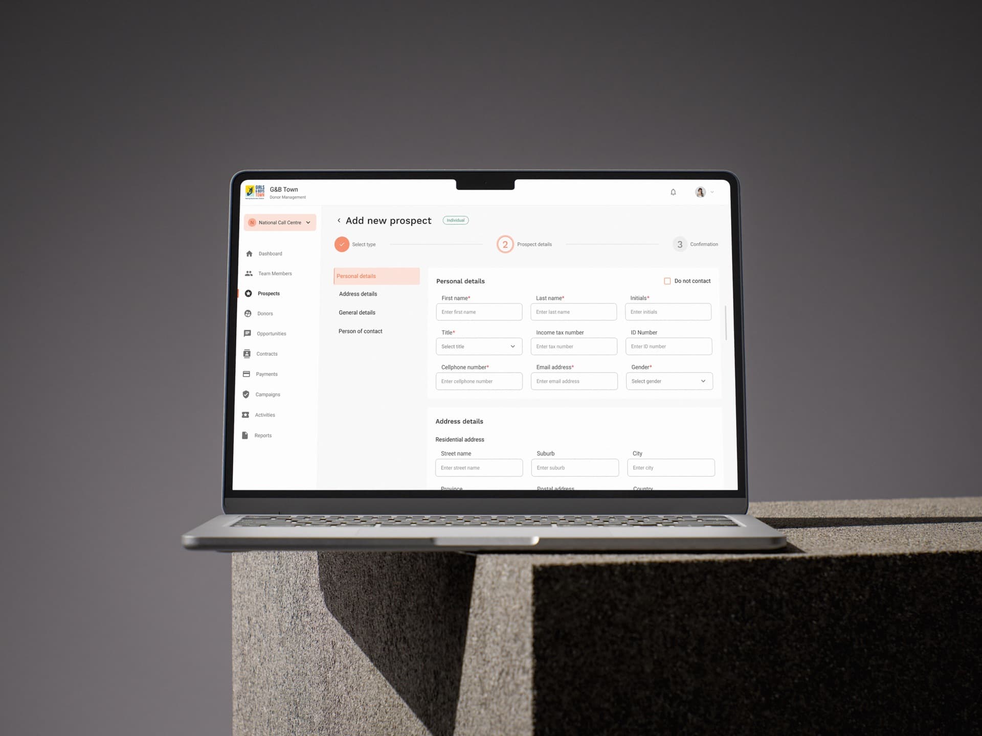
I mapped every flow before designing a screen, including the branches nobody asks for but everybody hits: a duplicate prospect name, a rejected transfer, a paused donation, an empty portfolio on day one. Two flows drove most of the system's shape. The diary to reminder loop has a consultant log a diary entry after a call and create a reminder from it, and when the reminder comes due and they complete it, the system offers a pre-filled diary entry to close the loop, so the record stays accurate because keeping it accurate is the path of least resistance. The two-stage approval chain sends a transfer or pool claim from Consultant to Branch Manager to Super Administrator, with distinct states at each gate, reasons required on rejection, and a notification at every step, including one back to the consultant confirming their request cleared the first stage.
Archive, do not delete
The brief asked for completed reminders to be deletable. But a completed reminder is a record of intent, evidence someone committed to an action and honoured it, and deleting it destroys the audit trail that makes the whole diary trustworthy. I designed an archive pattern instead: completed items clear out of the active list but stay restorable and auditable. The client accepted it, and the same reasoning went on to shape donations, where cancelling stops collection but preserves the giving history that tax certificates and reporting depend on. Where a true delete does exist (super administrators only), the interface actively steers toward cancelling and states plainly what deleting destroys.
Made the two-stage approval legible
Two-stage approval was a requirement; making it visible was not. A consultant who submits a request and sees only "pending" has no idea whether they are waiting on their manager or head office. I designed an explicit three-step tracker (Submitted, Branch Manager, Super Admin) onto every request, with distinct statuses per stage, a timeline recording who acted and when, and action buttons that name their real consequence: "Approve and forward" for the manager, "Approve and assign" for the admin.
Gave the system an obligation to the record
If the diary is the trustworthy source of truth, the product cannot just permit people to keep it complete, it has to contribute. Issuing a tax certificate, singly or in bulk, now writes a "Tax Certificate Sent" entry to the donor's diary automatically, marked system-generated and not hand-authorable.
Designed for volume, not just the single case
The requirements described generating a tax certificate from a donor's profile. Correct, but it ignores the actual problem: tax season means hundreds of certificates, and one at a time is the biggest chore of the fundraising year. I added a bulk flow: filter by branch or by who is outstanding, review the batch, send or download in one action, and put a standing prompt on the donor list showing how many donors still lack a certificate, so the job is visible before it is urgent.
Cut what the product could not yet honour
The original dashboards were dense with KPI scorecards, income versus target charts and performance analytics. Much of it graded consultants rather than helping them, and some referenced features that did not exist. I stripped every KPI block from all four dashboards and rebuilt them around a "Needs attention" queue that links straight into real work, moving the analytical content to a dedicated Reports section where it belongs. Navigation got the same treatment: every remaining item now leads to a page that exists. A dashboard that promises features the product does not have costs more trust than an empty state ever will.
Where it landed
Delivered as a complete interactive prototype: 19 connected screens across four roles, with every state designed, now serving as the reference the build is based on. The client has been very happy with the work to date.
What I learned
The requirements document is not the design. Requirements tell you what a client believes they need; they rarely tell you what a user does at 4pm on a Friday. The archive pattern, the completion nudge, the bulk certificate flow and the stripped-back dashboards all came from asking what happens after a feature ships.
A working prototype changes the conversation. Being able to say "click approve and see what the consultant gets" moved client sessions from opinion to observation. As the sole designer liaising directly with the client, that was the difference between defending decisions and demonstrating them.
Prototyping with AI before Figma is changing how I work. Building the structural draft fast and disposable in AI means Figma and development only ever touch decisions that have already survived a real client test. The line between prototype and design keeps moving earlier, and more of the value sits in framing the right questions and reading the answers than in producing the first artefact.
Designing four things beats designing one thing four ways. Four dashboards was more work than one with permissions, and it was the right call: the moment each dashboard had to answer one specific question, most of the clutter eliminated itself.
Saying no is part of the service. Every decision I am proudest of here started as a disagreement with the brief. Being the sole point of contact meant I had to make those cases myself, in plain language, with the reasoning visible.
What’s next
Bank file formats still need to be finalised. Debit order and credit card collection exports are designed and previewed in-product, with the column layout defined in one place so the bank's final spec is a single change.
National versus per-branch collections: the scope selector supports both while the client confirms how collections are actually run.
Usability testing with real fundraisers is next. The prototype is complete enough to test against real daily use, which is where I would expect the diary and reminder flows to earn their keep or get revised.