Neslo
A ground-up brand and website for Neslo, an end-to-end product delivery consultancy, and for Edufy, its subsidiary training and placing the next generation of South African developers. Two brands in one family, built as a team.
Head of Design at Neslo, working across brand and web as part of the team, from strategy through to the built sites.
Approach
This was a creative, collaborative project rather than a solo one: brand strategy first, then the identity, then the site, worked through together as a team in the studio. Once Neslo was settled, the same thinking extended to Edufy, whose audience (junior developers looking for a way into the industry, and the companies hiring them) called for a warmer, more energetic expression of the same underlying system.
The problem
Neslo works in a market full of agencies that place developers by the seat. Its whole pitch is the opposite: embedded teams, senior leadership, long-term ownership, and accountability for the outcome rather than the timesheet. The brand and the site had to carry that difference straight away. And the identity could not be a one-off, because Edufy, the training and placement subsidiary, was coming next, aimed at a completely different audience.
The goal
A brand and site for Neslo that reads senior, restrained and delivery-focused, sitting on a system flexible enough for Edufy to feel like family without feeling like the same thing.
Key decisions
Two brands, one family, deliberately different in temperature
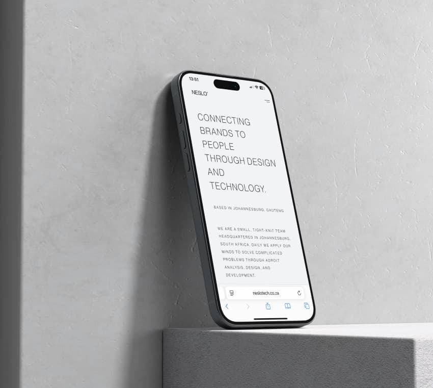
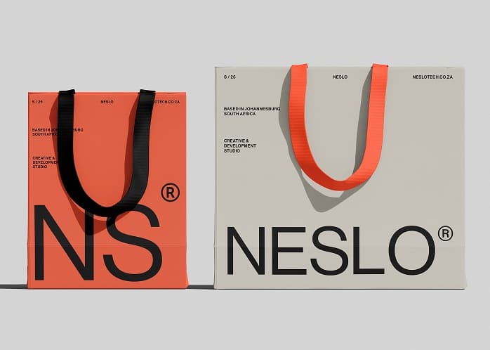
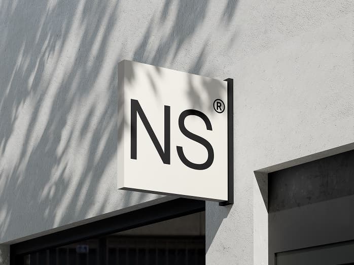
Neslo's product is almost entirely monochrome on an off-white ground, restraint doing the talking: the look of a firm senior enough not to shout. The same coral accent that carries the wordmark on print and merch, tote bags, signage, stays out of the product itself. Edufy keeps the same structural DNA but turns the temperature up, leading with that accent in the product, because its job is to feel like an opportunity rather than a procurement process. One system, two clearly different reads.
Built the site, not just the brand
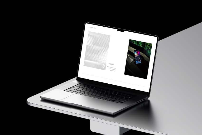
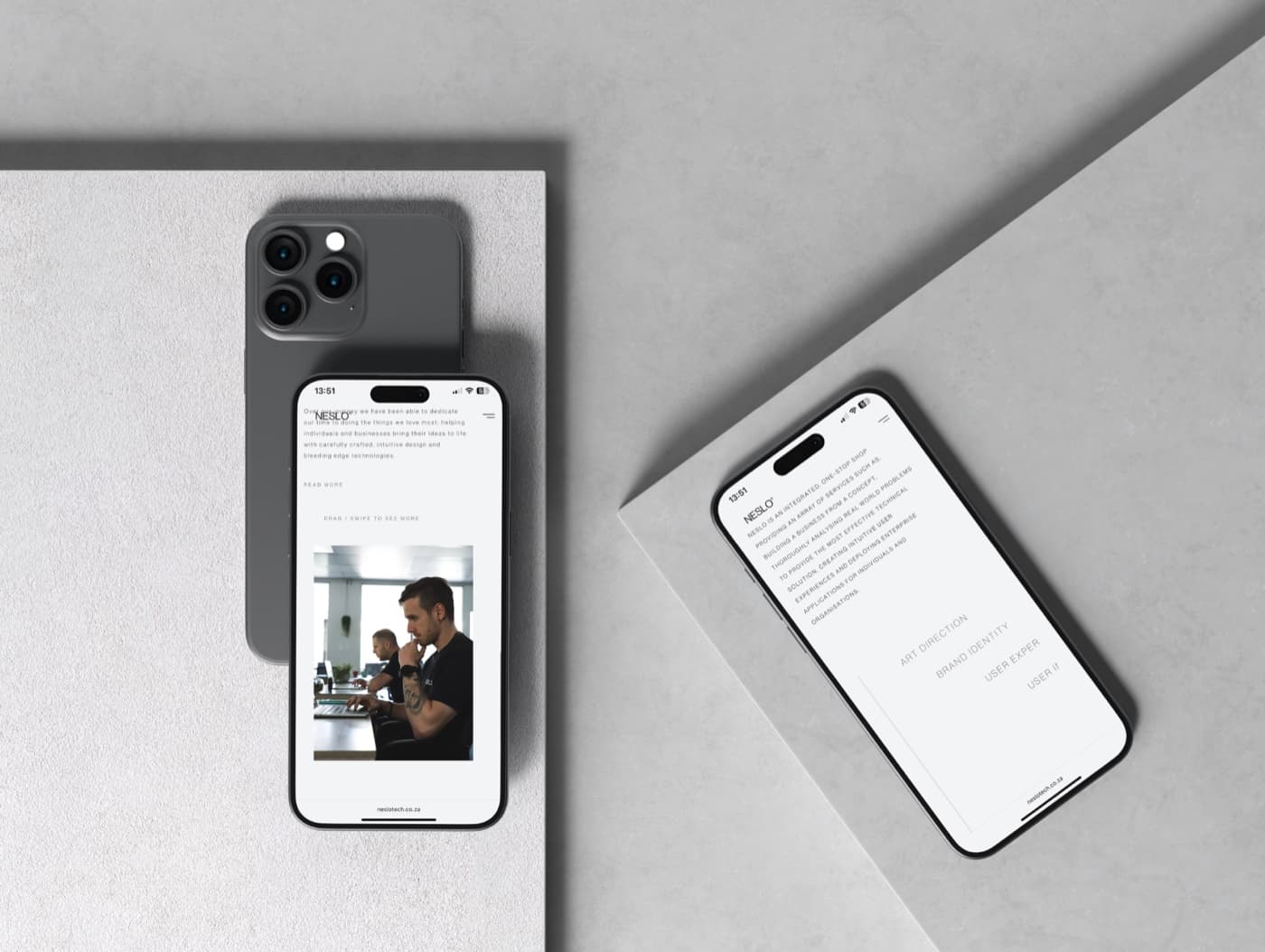
The engagement ran past the identity into a built, live website, so the brand was pressure-tested in a real product rather than a set of guidelines. Structuring it as a family from the start meant Edufy could be added as a subdomain later without unpicking the parent.
Style guide
The product runs monochrome, black and white on an off-white ground. The same coral accent that names the wordmark on tote bags and signage is kept for print and merch, off the site itself. Edufy shares the neutral base but brings that accent into the product, carrying the warmth its audience needs.
Neslo is plain and direct, with no sales gloss. Edufy is warmer and more encouraging, written for people still deciding whether a tech career is open to them at all.
Where it landed
Both sites are live: neslotech.co.za for the consultancy and edufy.neslotech.co.za for the subsidiary.
What I learned
Designing a parent brand and a subsidiary together forces the system to be real. Making one brand look good is easy; making a second one clearly belong to it without copying it is where the actual system work happens.
A restrained brand is harder than a loud one. With almost no colour to lean on, the work goes into type, spacing and pace, and every decision is more exposed because there is less to hide behind.
Working as a team, in the room, made it better. Quick reactions to work in progress caught things early that a formal review cycle would have waved through.