PT Flash
An app that helps parents manage their children's extra-mural activities while giving providers a portal to list and track them. Research surfaced two distinct needs: parents wanted one mobile-first place to browse, book, and track schedules instead of scattered WhatsApp groups and paper notes, while providers wanted to manage capacity and cancellations without extra admin. So the product split into two tailored journeys built from that research.
The problem
Parents faced a scattered, time-consuming process managing their children's extra-mural activities: communication with providers was fragmented and handled manually, and schedules were hard to track. On the other side, service providers had no centralised way to promote their offerings or manage enrolments efficiently. Neither side had a system built for how they actually worked.
The goal
Design a digital tool that simplifies the entire extra-mural experience for both parents and providers: one place for parents to browse, book, and track activities, a professional portal for vendors to list services and manage schedules, a seamless experience across desktop and mobile, and trust built through clarity, organisation, and ease of use.
User research
To understand the needs of both parents and providers, I gathered insights through informal interviews, online research, and competitor analysis. This validated the need for two tailored user flows, one for parents and one for providers, while keeping the overall experience unified and easy to use.
Parents struggle with scattered communication (WhatsApp groups, emails, paper notes).
Many parents manage multiple children's schedules, making overlap and double-booking common.
Providers often rely on outdated systems (spreadsheets, manual payments) to manage enrolments.
Parents expect mobile-first access and simple reminders.
Providers value tools that save time, not add extra admin.
User insights
“Parents want transparency, clear schedules, pricing, and easy booking confirmations.”
“Providers want control: the ability to update class times, manage capacity, and handle cancellations.”
“Both sides value simplicity and don't want to learn a complex system.”
“Mobile is the primary touchpoint for parents managing schedules on the go.”
Persona
Parent · Ages 30–45, primary-school-age children
Wants one central place to manage activities, reminders, and confirmations, frustrated by fragmented communication and double-bookings.
Provider · Ages 28–50, offers specialised classes
Wants a simple system to publish, update, and manage classes, frustrated by manual processes, inconsistent enrolment tracking, and admin overload.
Journey map
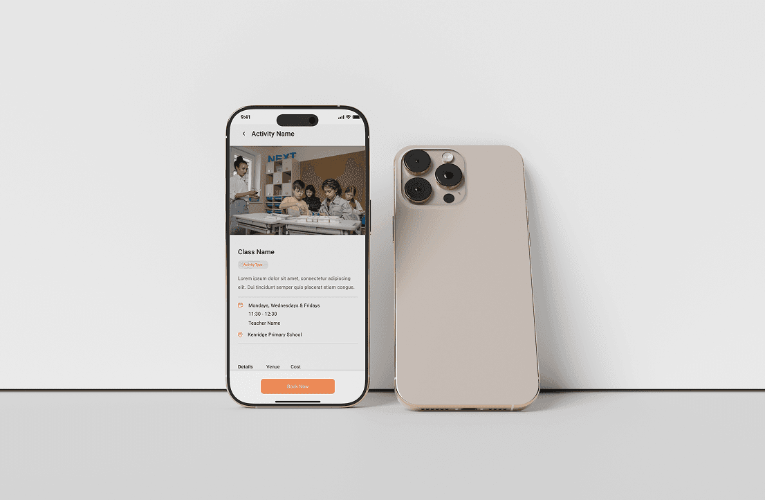
Wireframes
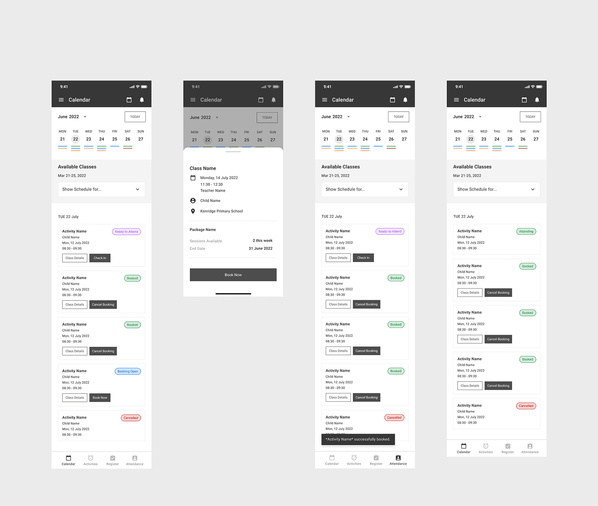
Initial wireframes focused on clarity and simplicity across both portals.
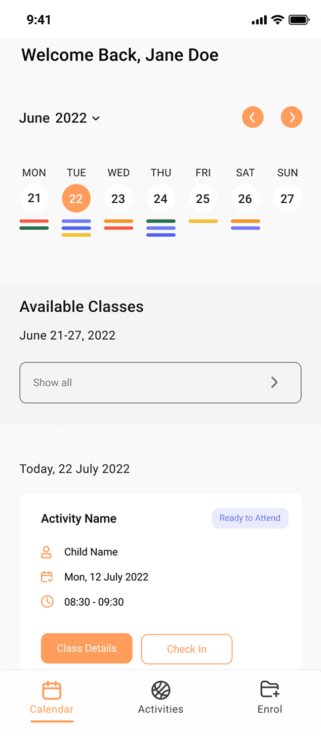
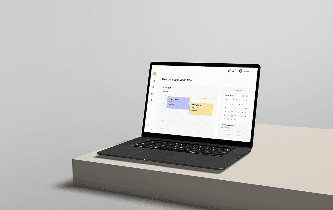
Parent dashboard with a calendar view and upcoming activities.
Vendor dashboard for managing listings and schedules.
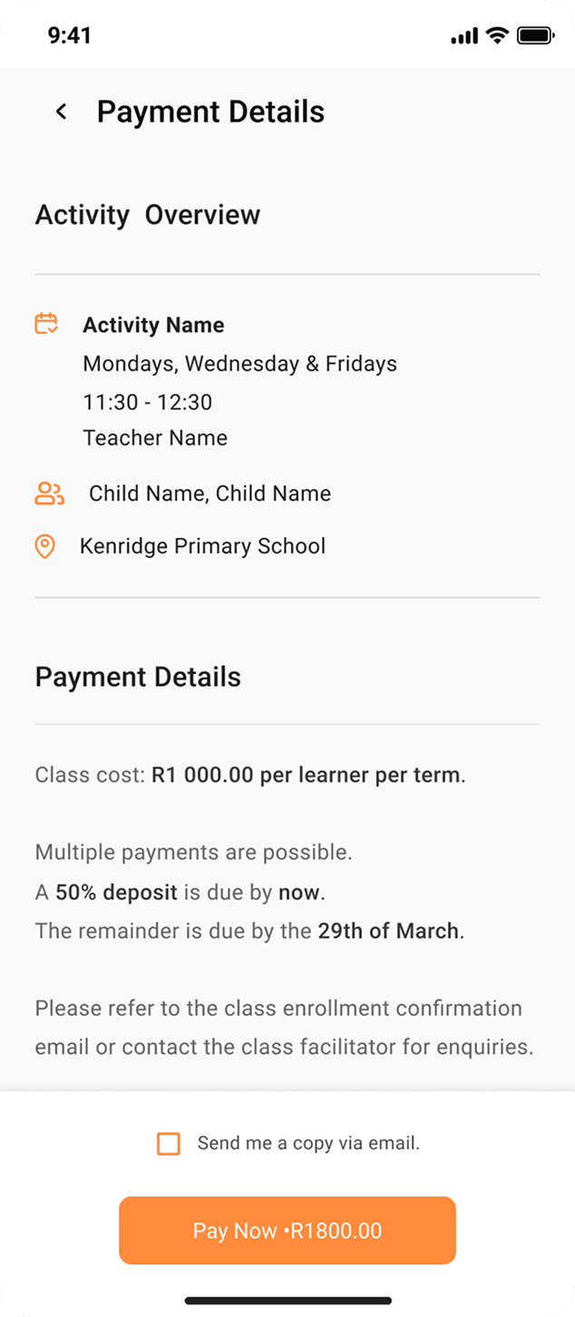
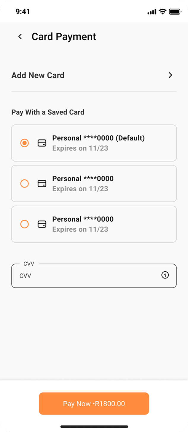
Streamlined booking flow with minimal steps.
Mobile-first layouts, ensuring all features were accessible on small screens.
Key decisions
Designed two tailored journeys from day one, not one generic flow
Research made the split obvious: parents wanted a simple, mobile-first way to browse, book, and track activities without learning a new system, while providers wanted control over class times, capacity, and cancellations without extra admin. The journey map treated Discover → Book → Track → Manage (parents) and Create → Manage → Engage → Review (providers) as two first-class flows, not a parent app with a provider settings page bolted on.
Prioritised mobile-first, low-friction booking based on what parents actually said
Research showed mobile is the primary touchpoint for parents managing schedules on the go, and that both sides valued simplicity over feature depth. Wireframes were built mobile-first around a streamlined booking flow with minimal steps, instead of porting a desktop-first admin tool down to a smaller screen as an afterthought.
Where it landed
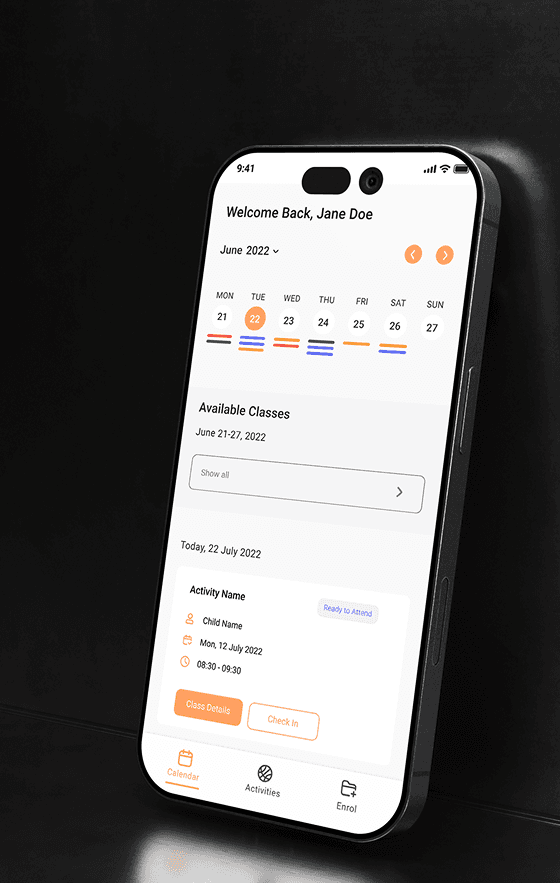
Design completed and handed off to development for build.
What I learned
Designing for two distinct but connected user groups meant balancing consistency and specificity: shared, clear patterns across both portals, with individual features tailored to how parents and providers actually behave.
Reminders and notifications mattered more than expected in a behaviour-driven app like this, a small detail that shaped how much people ended up trusting and using the product.
Early wireframes stayed deliberately narrow (calendar-based dashboards, streamlined booking, mobile-first layouts) rather than trying to fit every admin feature into the first version.