FNB
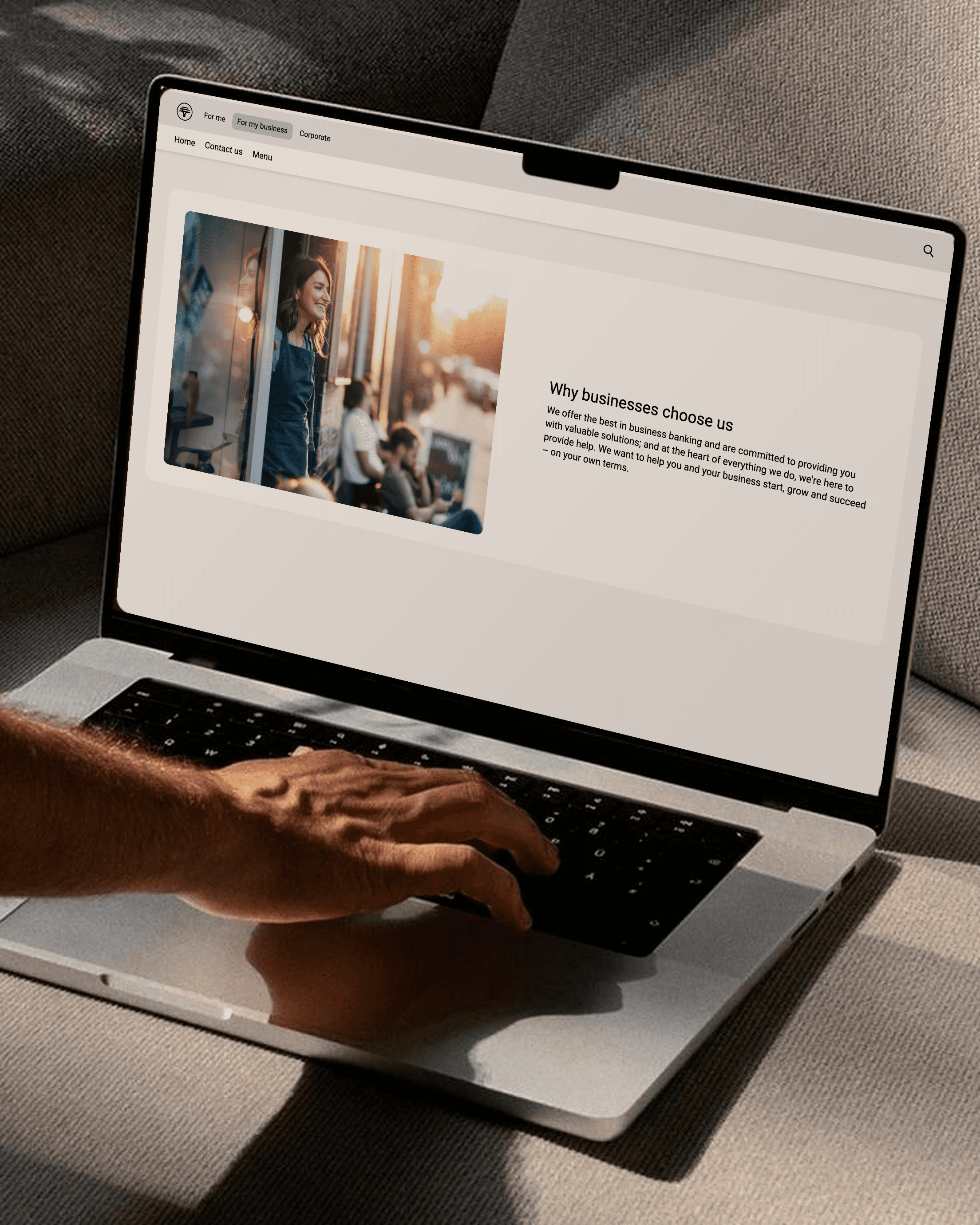
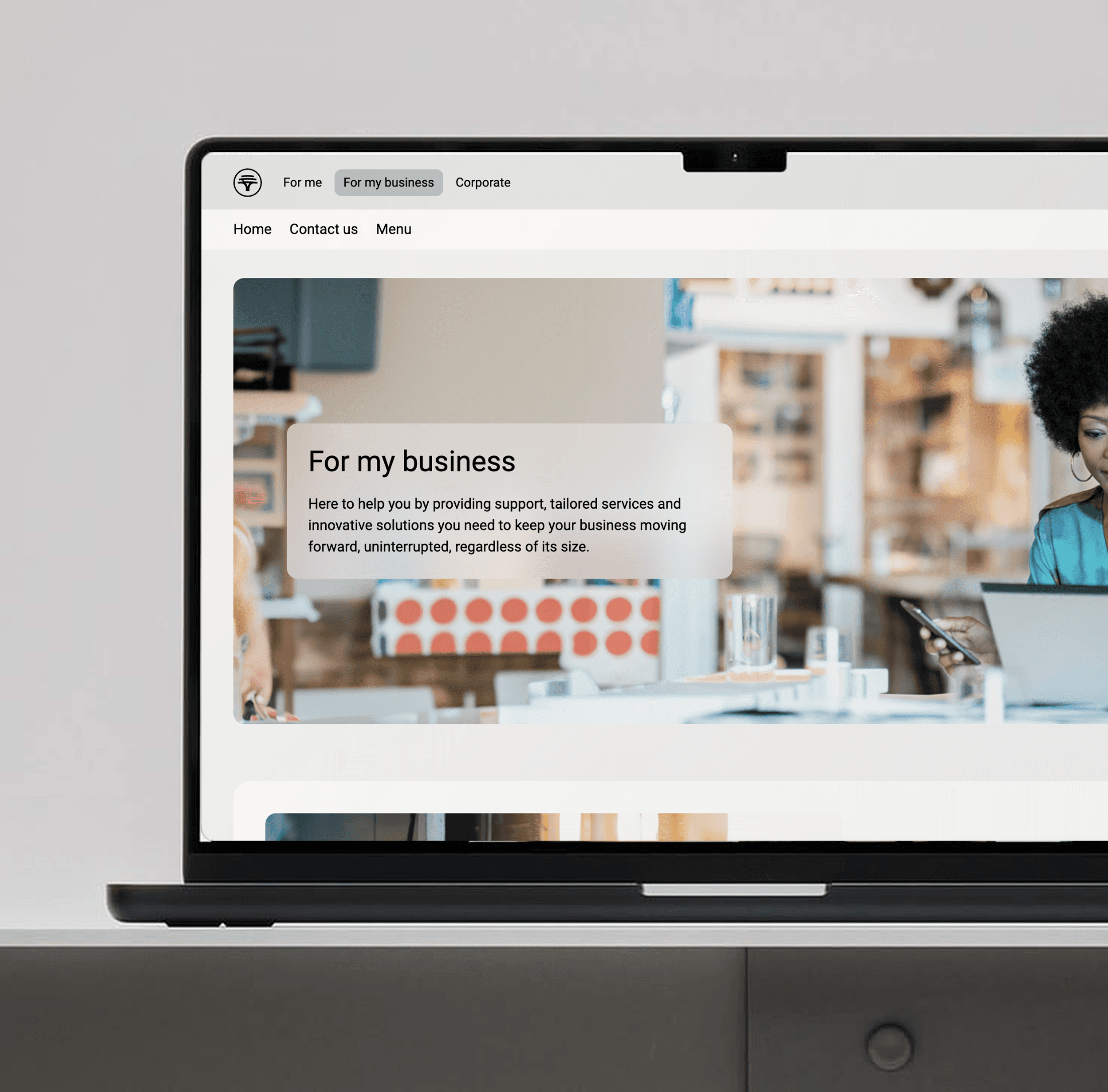
Ongoing UI/UX design work at FNB, helping migrate a large enterprise banking platform onto a single shared framework and using the migration as a chance to improve the underlying flows, not just reskin what existed.
UI/UX Designer within FNB's enterprise banking team, collaborating directly with stakeholders, the business, developers, and subject matter experts.
The problem
FNB's site had grown page by page, with different areas built on different frameworks and no shared consistency between them. That made the experience unpredictable for customers and made it harder to improve any one part without affecting the rest. The business needed every page migrated onto a single framework, and treated that migration as an opportunity to create a more impactful experience for users, not just a like-for-like rebuild.
The goal
Move the platform from a rigid, template-driven framework, where screens were assembled from fixed layout slots with limited compositional flexibility, to a component-driven, token-aware system that supports dynamic theming, responsive containers, and real-time data binding, so pages stop being built by developers per spec and start being composed by designers from a governed system.
Key decisions
Questioned scope before executing it
Every request got weighed as 'should we' before 'could we': design decisions were never made just because they were technically possible. Where a request did not clearly serve the user or the business, that got pushed back on rather than quietly built.
Audited every legacy screen and defined the token contracts before design work began
Rather than starting the new component library from a blank page, I mapped every existing screen against the new component model, deciding case by case what deserved to become a reusable component versus a one-off composition that did not need to set a pattern. I also defined the colour, spacing, typography, and elevation token contracts the legacy framework had never had, so development had a governed system to build against instead of hardcoded values per screen.
Owned consistency across two frameworks running in production at once
For a stretch of the migration, old and new pages rendered side by side in production, so consistency had to be actively maintained rather than assumed. I also moved design handoff onto a Figma source of truth that developers could consume directly through the new component pipeline, replacing the old process of screenshots and written specs.
Where it landed
Strong feedback from stakeholders so far, with a target of migrating more than 100 pages onto the new system.
What I learned
This is ongoing: the business is partway through the migration, with a number of pages already moved onto the shared framework and the rest in progress.
A UI designer being central to this kind of migration, not downstream of it, is what turns a technical re-platform into a product upgrade users actually feel, rather than just a swapped-out rendering engine.